
The Juicee Nail Bar
challenge
New to New York, I was on the hunt for a good nail salon. I stumbled upon The Juicee Nail Bar, which offered Russian nail treatments in South Queens (rare for the area). I met the owner, Tailyn, and we hit it off immediately. At the time, Tailyn was doing nails from her home but offered an array of services. One thing that stood out to me as a client was Tailyn’s advocacy for healthy nails and how she communicated with me throughout the process on the condition of my nails and what she planned to do to keep them healthy and strong. I soon learned that Tailyn planned to expand The Juicee Nail Bar to a physical space and was interested in building a full brand identity system.
Solution
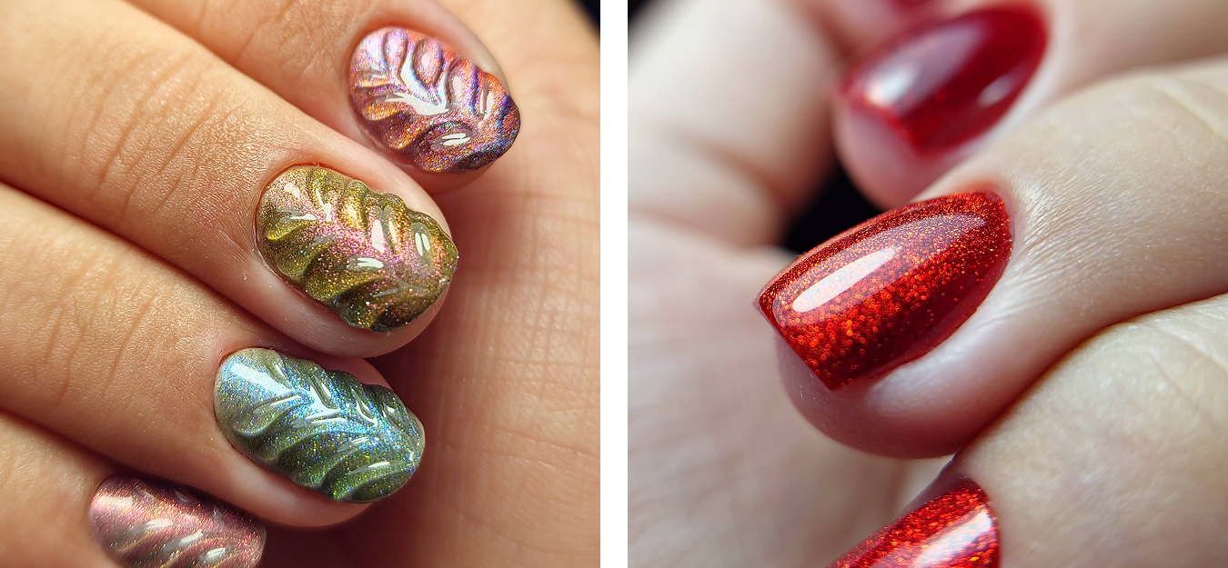
There aren’t many nail salon experiences like The Juicee Nail Bar. It is easy to feel like a number when getting your nails done. Most services are quick and happen without much communication or care for your natural nails. The Juicee experience offers something slower and intentional. While the world chases enhancements, The Juicee Nail Bar champions education and empowerment, guiding clients on their unique nail journey. The service focuses on precision, communication, comfort, and above all, healthy nail care.
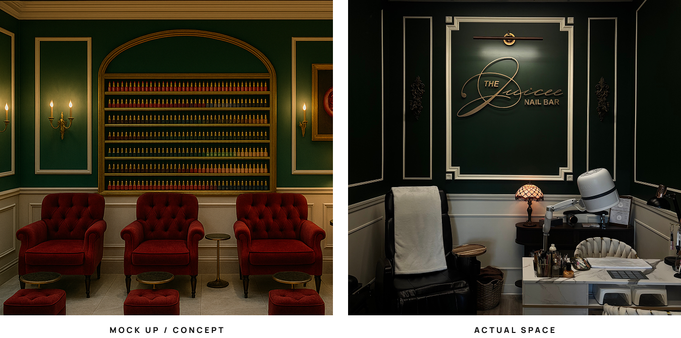
I was tasked with bringing Tailyn’s brand to life and designing the salon space that she was soon to open. It was important that the branding and salon highlight The Juicee experience as a key differentiator.
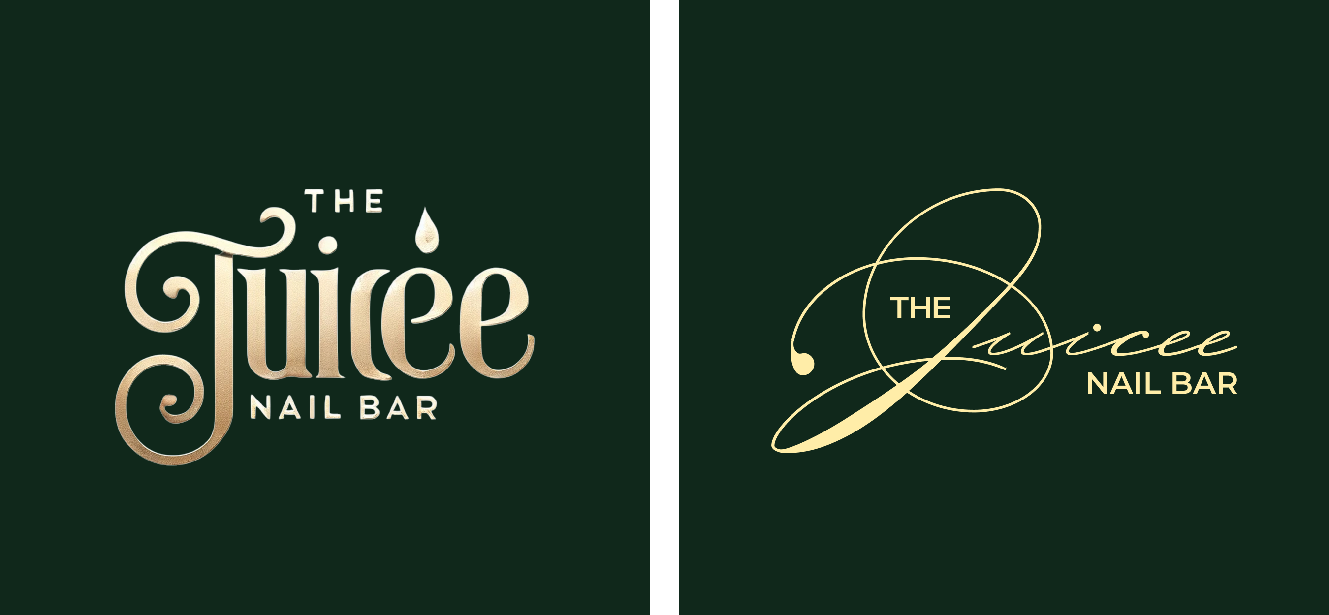
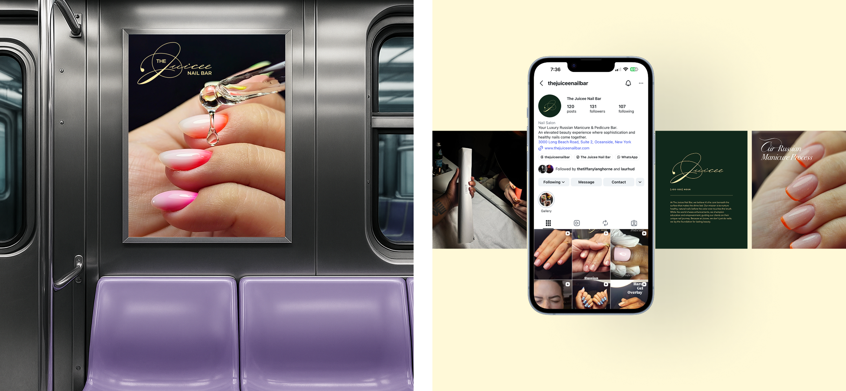
The original Juicee logo had fun elements that I wanted to maintain, such as the script ‘Juicee’ and the drop of polish. The new logo introduces a new typeface that elevates the branding as an ode to the luxury nail experience.
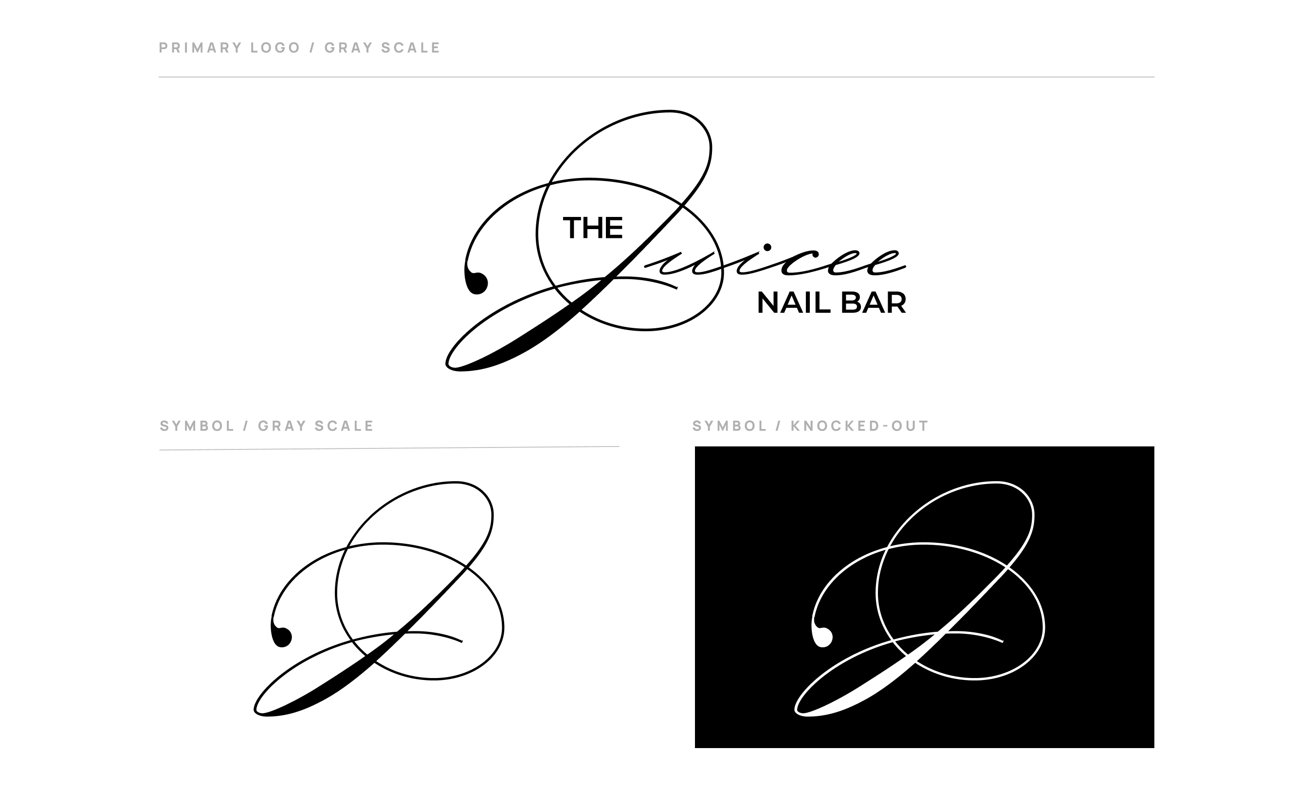
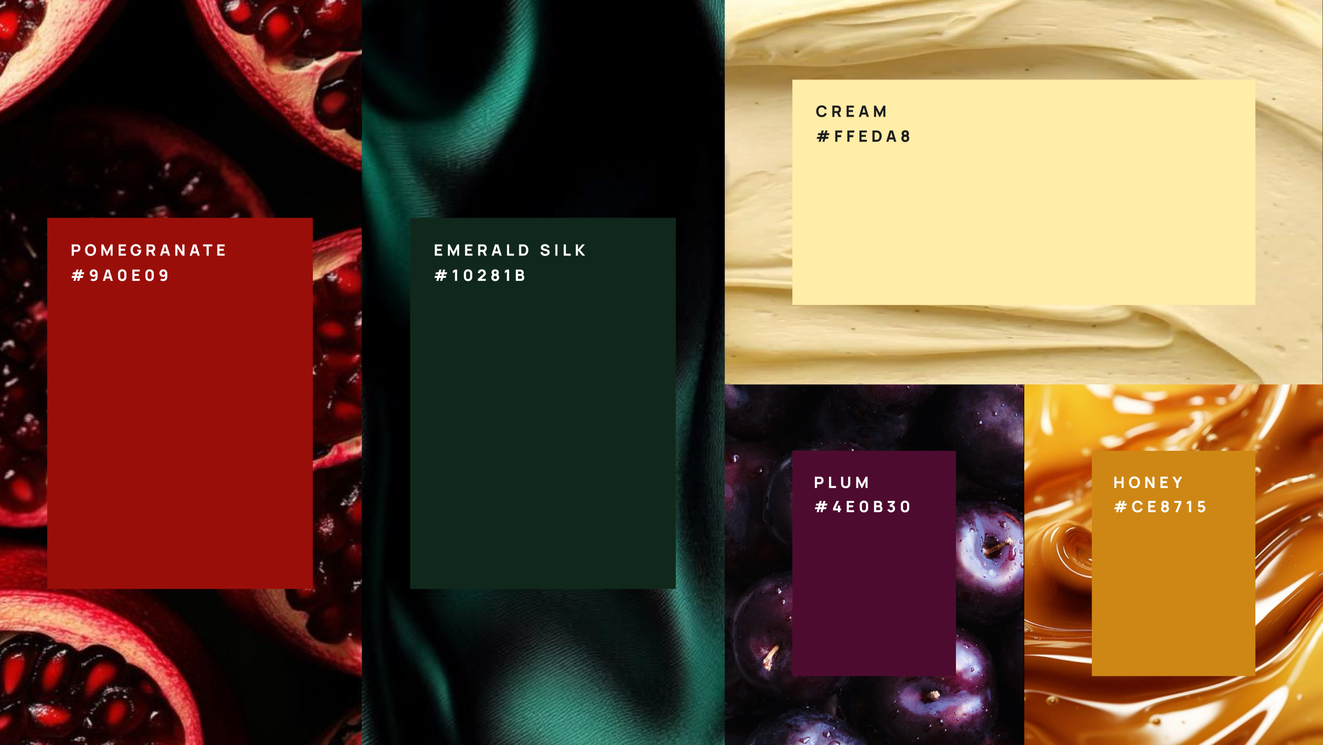
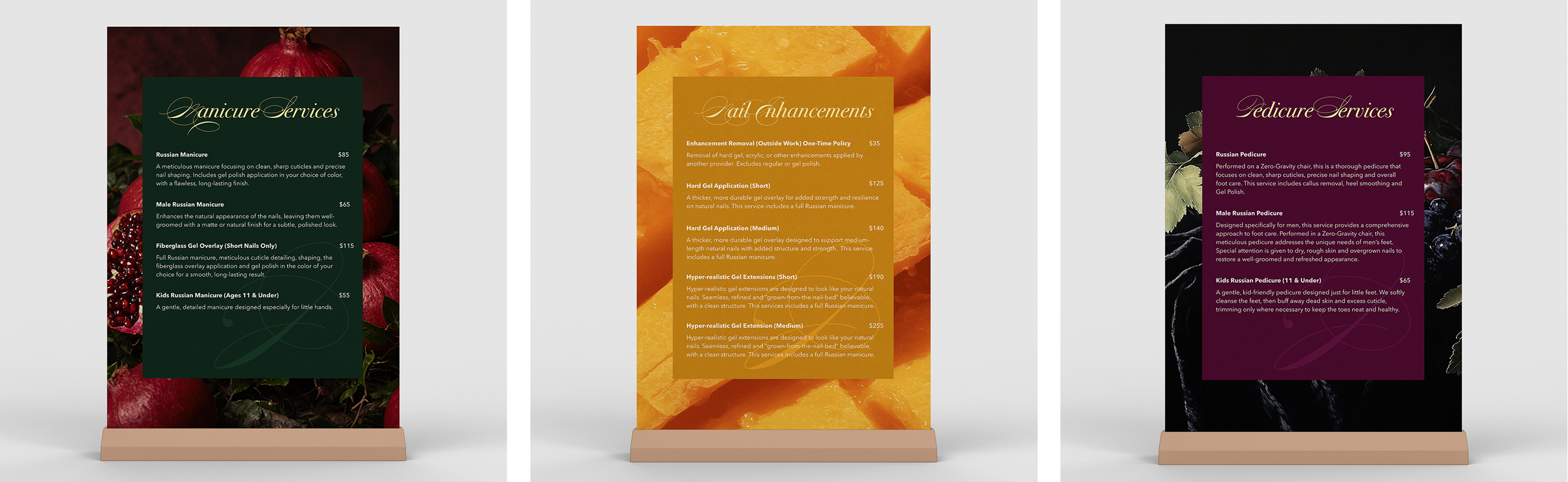
I wanted the brand to feel like the service that Tailyn provides. It’s more than a service; it is a ritual, so I brought in dark, moody jewel tones to make the brand feel relaxing and sophisticated. There is quite a bit of wordplay and metaphors in this branding. Tailyn has a background in construction. In fact, it is through buffing and polishing flooring that she recognized the similarities in nail care. Her unique background plays a huge role in her approach to nail services, so the brand uses phrases like “buffing out flaws” or “laying the foundation for lasting beauty.”
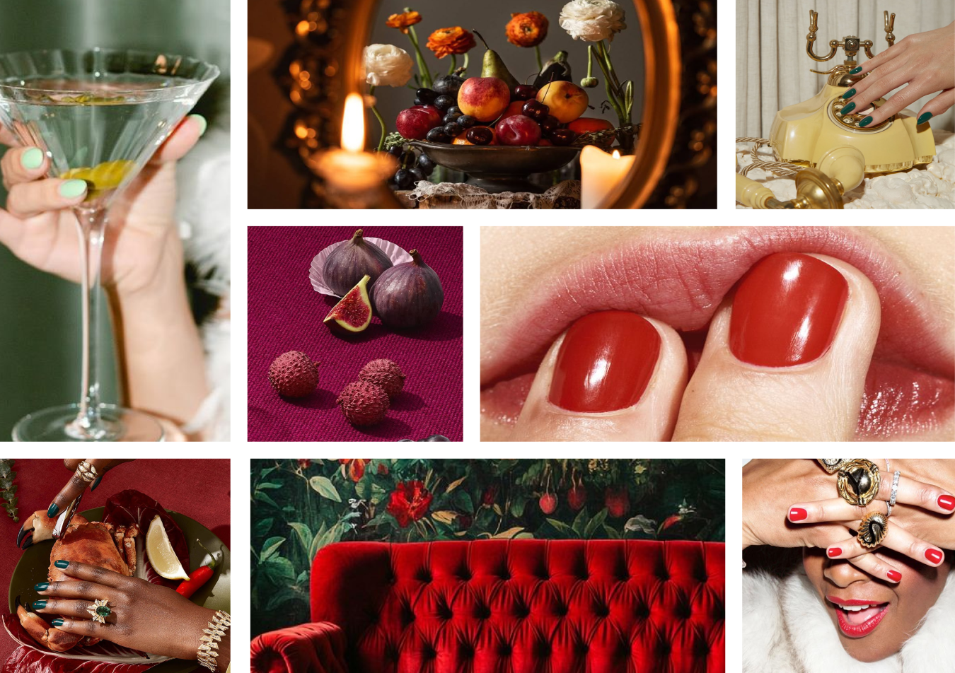
I began to wonder what makes the “Juicee” experience, well, juicy. I wrote down words like supple, rewarding, and enjoyable. Much like The Juicee Nail Bar. In the end, I kept thinking of fruit. Juicy plums, peaches, mangoes, etc. Since we love metaphors here, I wanted to bring fruit into the brand language as a cheeky nod to the Juicee experience. The brand imagery is a mix of lifestyle photography, still lifes or juicy fruits, and close-up photos of nails.

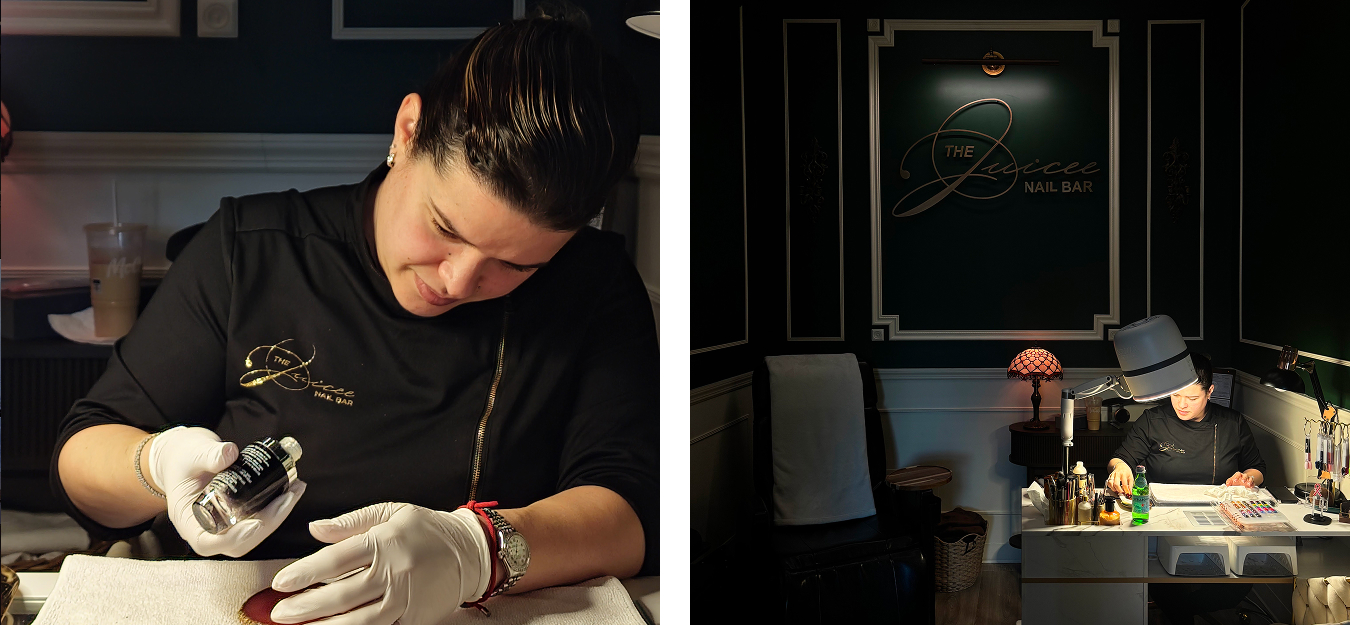
My first appointment with Tailyn was at her home, where she made the experience as comfortable as possible (she literally made me a sandwich). This focus on comfort, which is central to both her and her brand, carries over into the design of her salon. The physical space is intentionally crafted to feel like you've stepped into a living room. Unlike other salons with a stark atmosphere, The Juicee Nail Bar is moodier and more relaxing. To achieve this, we brought in molding along the walls, tufted chairs, and antique furniture. Many of the items in the space are pre-loved and sourced from markets. Further enhancing the welcoming atmosphere, clients are greeted with a fully stocked espresso and snack bar. For pedicure clients, Tailyn offers a fresh blanket and performs the service in a Zero Gravity chair, ensuring maximum comfort throughout the experience.


Launch Experiences
With the launch this new product, the idea is to create immersive experiences and installations around the city. Glossier would take over Manhattan with giant sculptures of the product in uptown, midtown, and downtown, creating a photo op scavenger hunt. Each sculpture will be strategically placed in a neighborhood to reflect its namesake. Fairy can be found in Central Park amongst the trees, Siren is sitting pretty on a pier in Seaport, and Supernova is in the heart of Times Square, reflected in the lights for an intergalactic feel.
Glossier has always been big on customer experience. With G Light, the idea is to tap into that connection: unexpected fun and, let’s be real, free stuff because who doesn’t love that? The launch of this product continues with a party where people can test the powders and create content and connections. Tote bags as cute takeaways, and even a claw machine where guests could try their luck at winning a G Light powder. The goal is to make the launch feel exciting, shareable, and totally Glossier.
other
/ (projects)

